

Fall Color Trends: 9 Warm & Unexpected Shades for Your Home
Fall decorating often brings the same colors to mind: burnt orange, rusty red, golden yellow, and plenty of brown. They are beautiful, but they are not the only way to bring an autumn feeling into your home.
Some of the most inviting fall interiors rely on quieter, deeper, and more unexpected shades. Think chocolate brown instead of bright orange, olive green instead of leafy green, or dusty blue paired with warm terracotta. These colors can create the warmth associated with autumn while still feeling sophisticated and easy to live with.
The best part is that you do not need to completely redecorate your home for the season. A thoughtful combination of color, texture, and a few well-chosen accents can be enough to change the mood of a room.
Here are nine fall color trends to inspire a warmer, more layered home.
Fall Color Is More Than Orange, Red, and Yellow
Traditional autumn colors are inspired by the changing landscape: fallen leaves, pumpkins, warm sunlight, and earthy ground tones. But when those ideas are translated into interior design, the palette can become much broader.
Look beyond obvious seasonal colors and consider shades inspired by natural materials and deeper autumn landscapes. Rich wood tones, mossy greens, faded blues, warm neutrals, and wine-inspired hues can all create a cozy atmosphere.
The key is not to use every fall color at once. Instead, choose one or two colors that complement the existing palette of your home and build from there.
9 Fall Colors to Bring Into Your Home
1. Chocolate Brown
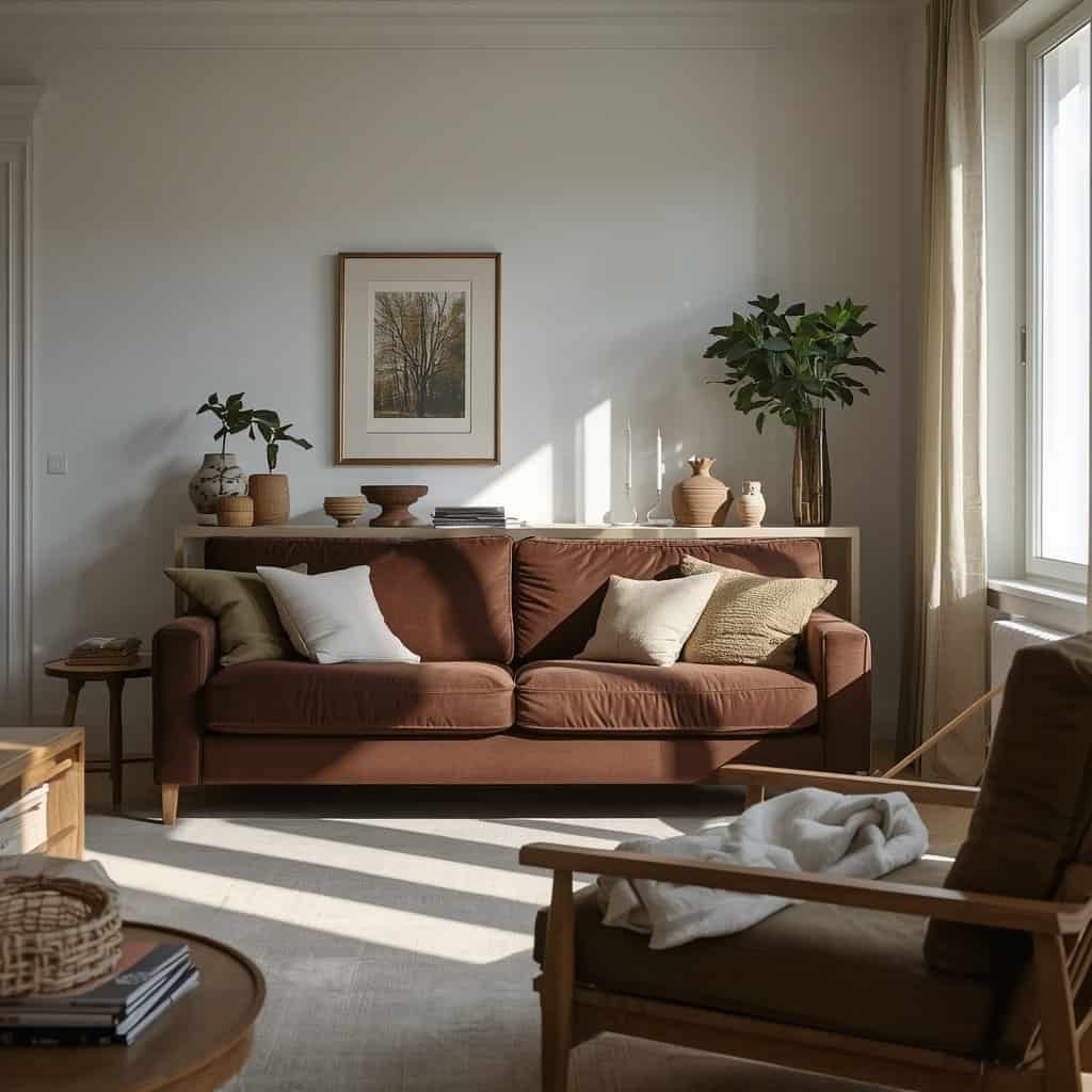
Chocolate brown is one of the easiest colors to use when you want a room to feel instantly warmer. It has the grounding quality of a neutral but adds considerably more depth than pale beige or gray.
A brown sofa can become the foundation of a living room, while smaller touches such as cushions, rugs, curtains, or ceramic accessories can introduce the color without committing to a large piece of furniture.
Chocolate brown works particularly well with warm cream, olive green, natural wood, and muted blue. If your room already has plenty of wooden furniture, use brown through textiles and upholstery rather than adding more dark furniture.
The result feels cozy and collected rather than heavily decorated for fall.
2. Olive Green
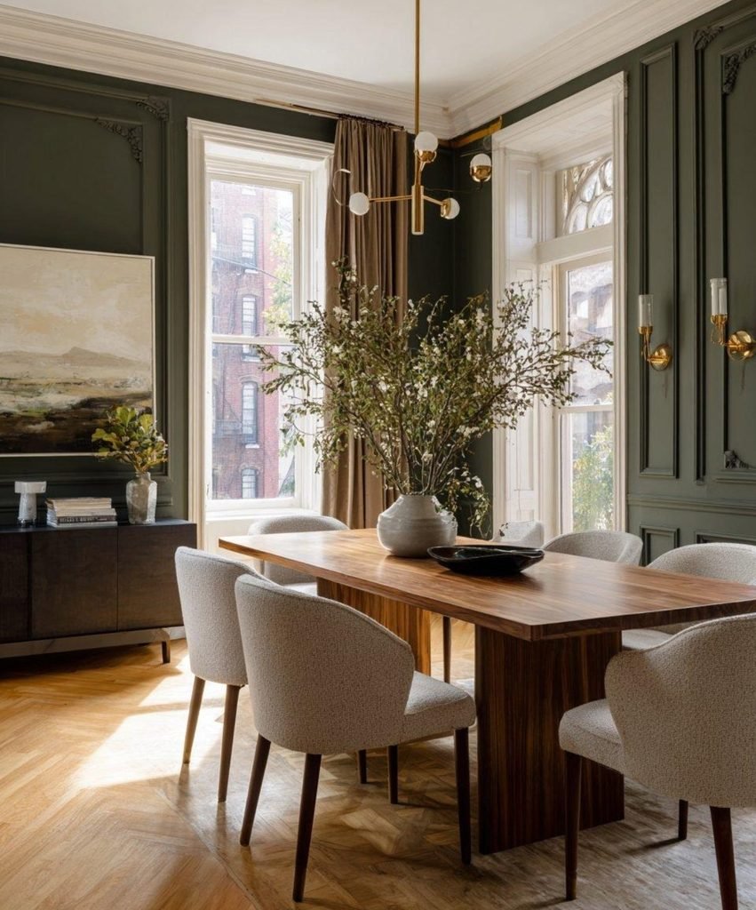
Olive green brings an earthy, botanical quality into a room without feeling overly bright. Its muted character makes it surprisingly versatile, especially when paired with natural materials.
Try olive through an upholstered chair, cushion, throw, artwork, or even a painted accent wall. In a dining room, olive can look especially beautiful alongside wooden furniture and simple tableware.
For a softer palette, combine olive with warm cream and natural linen. For something moodier, pair it with chocolate brown or darker wood.
Because olive is closely connected to nature, it can also transition easily into other seasons.
3. Deep Burgundy
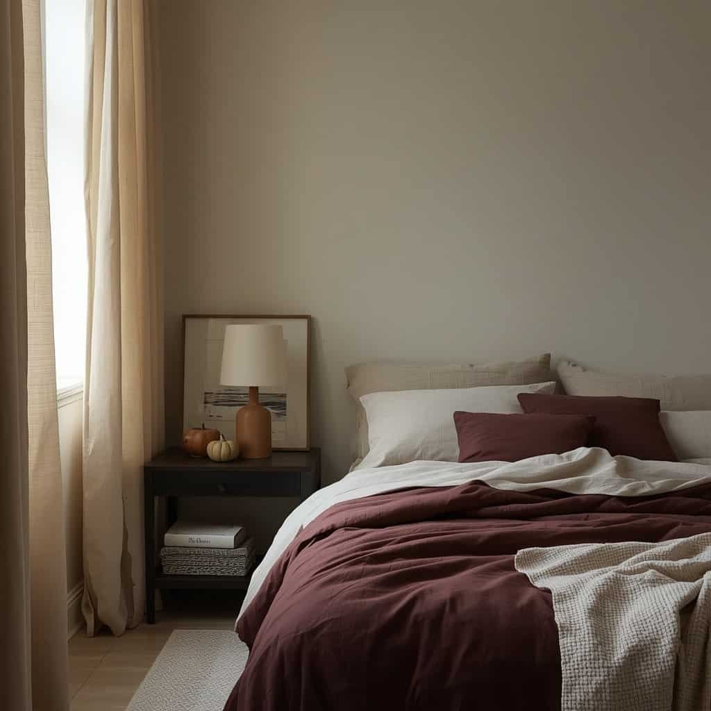
Deep burgundy adds richness without requiring a dramatic change to the room. It is particularly effective as an accent color because even a small amount can make a space feel more layered.
Instead of using burgundy everywhere, consider a velvet cushion, upholstered dining chair, artwork, table linen, or small decorative object.
Burgundy looks especially sophisticated with warm cream and brown. Add aged wood or brushed metal for a more collected look, or combine it with soft neutral textiles if you want the color to remain the focal point.
It is a good choice for bedrooms and dining spaces where a little extra depth can create a more intimate atmosphere.
4. Burnt Terracotta
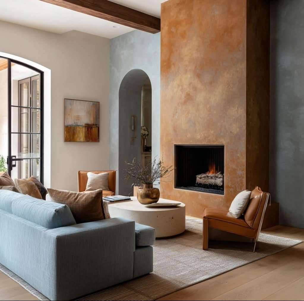
Burnt terracotta is perhaps the most recognizably autumnal color on this list, but it does not have to look predictable.
The secret is to choose a muted, earthy terracotta rather than an intense orange. Think clay, brick, and sun-warmed earth rather than bright pumpkin.
Terracotta works beautifully through pottery, cushions, rugs, artwork, and small furniture pieces. It also pairs surprisingly well with dusty blue, creating a balance between warm and cool tones.
Combine it with cream and natural wood for a relaxed look, or introduce darker brown for a richer autumn palette.
5. Muted Mustard
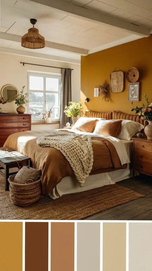
Mustard can bring a little brightness to an autumn palette without losing its warmth. A muted or earthy mustard is much easier to incorporate than a vivid yellow.
Use it sparingly through cushions, throws, artwork, lampshades, or dining accessories. One or two mustard accents can be enough to give a neutral room more personality.
Mustard works particularly well with olive green, chocolate brown, warm cream, and natural wood.
If the rest of your room is fairly neutral, it can also act as a small visual highlight without making the entire space feel themed around fall.
6. Dusty Blue
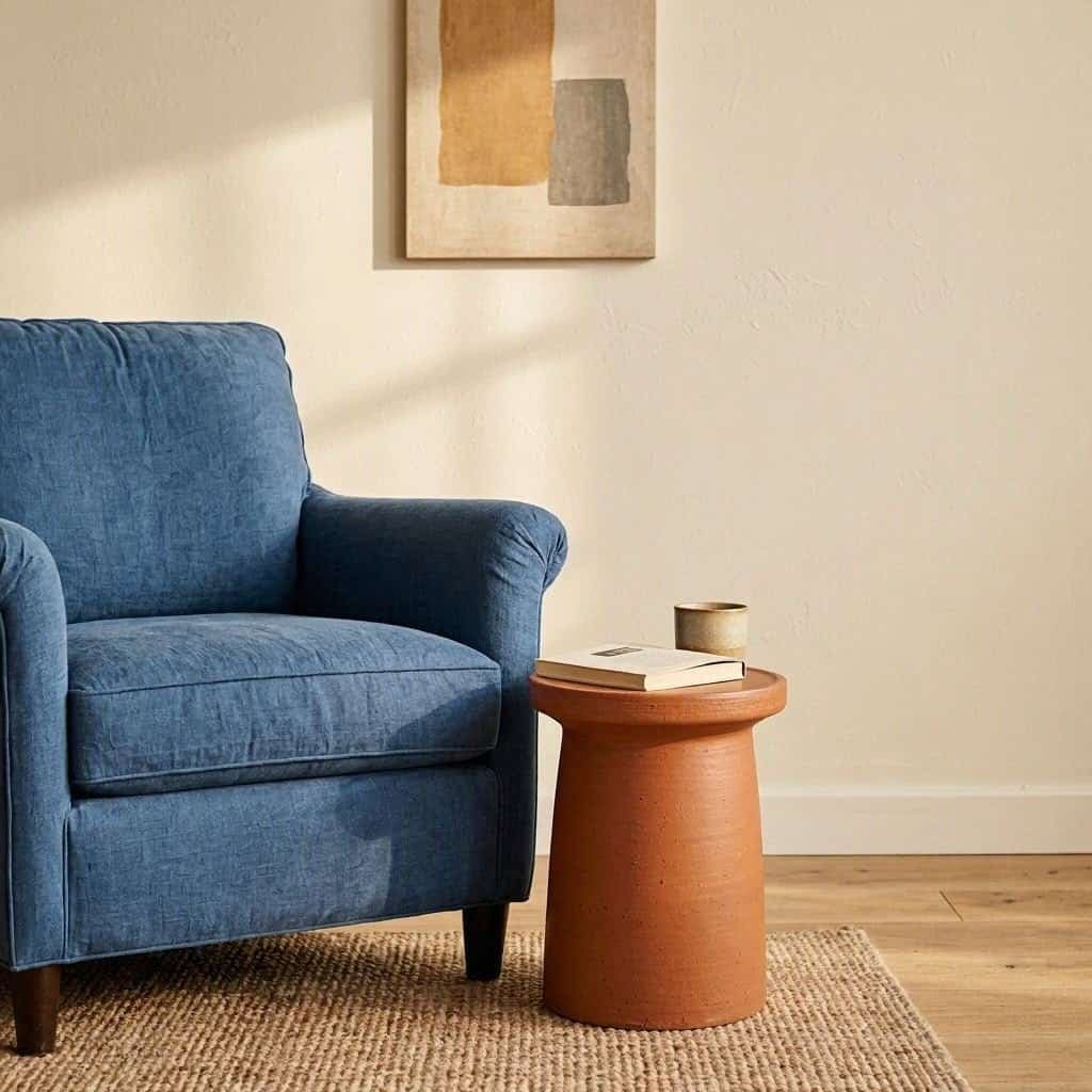
Dusty blue may not be the first color you associate with autumn, which is exactly what makes it interesting.
A muted blue introduces a cooler element into a traditionally warm seasonal palette. Rather than fighting with autumn colors, it can actually make them feel more balanced.
Try dusty blue with burnt terracotta, chocolate brown, or warm cream. A blue upholstered chair, bedding, rug, or piece of artwork can create contrast while keeping the overall room calm.
This is also one of the easiest colors to carry beyond fall. Unlike strongly seasonal shades, dusty blue can work just as well in a spring or summer interior.
7. Plum and Aubergine
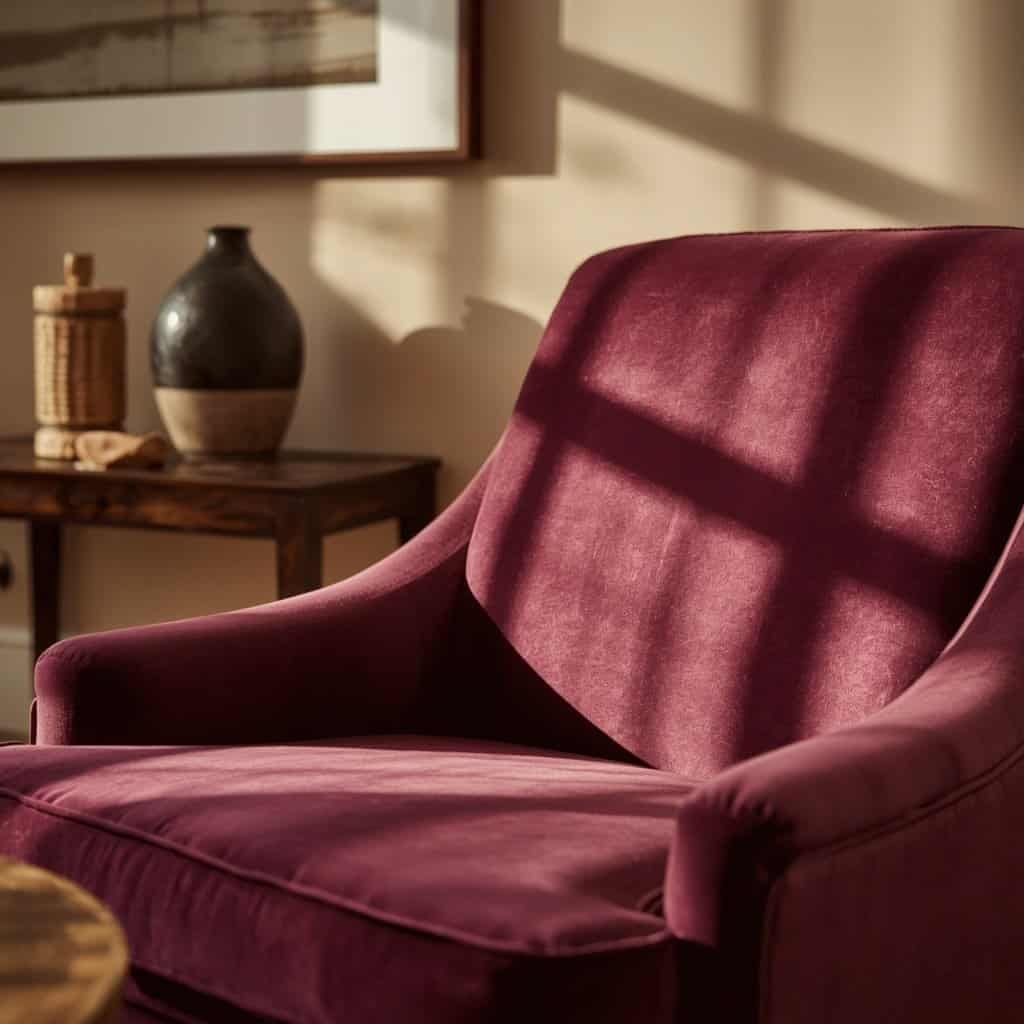
For a deeper and more dramatic palette, consider plum or aubergine. These shades sit somewhere between purple, burgundy, and brown, giving them a rich quality that works beautifully in cozy spaces.
You do not need much of this color. A single accent chair, cushion, curtain, artwork, or decorative piece can be enough.
Plum looks particularly good with warm cream, chocolate brown, olive, and natural wood. In a bedroom or reading corner, it can create a slightly moody atmosphere without relying on black.
If your interior already uses neutral colors, this is an easy way to introduce more personality.
8. Warm Cream
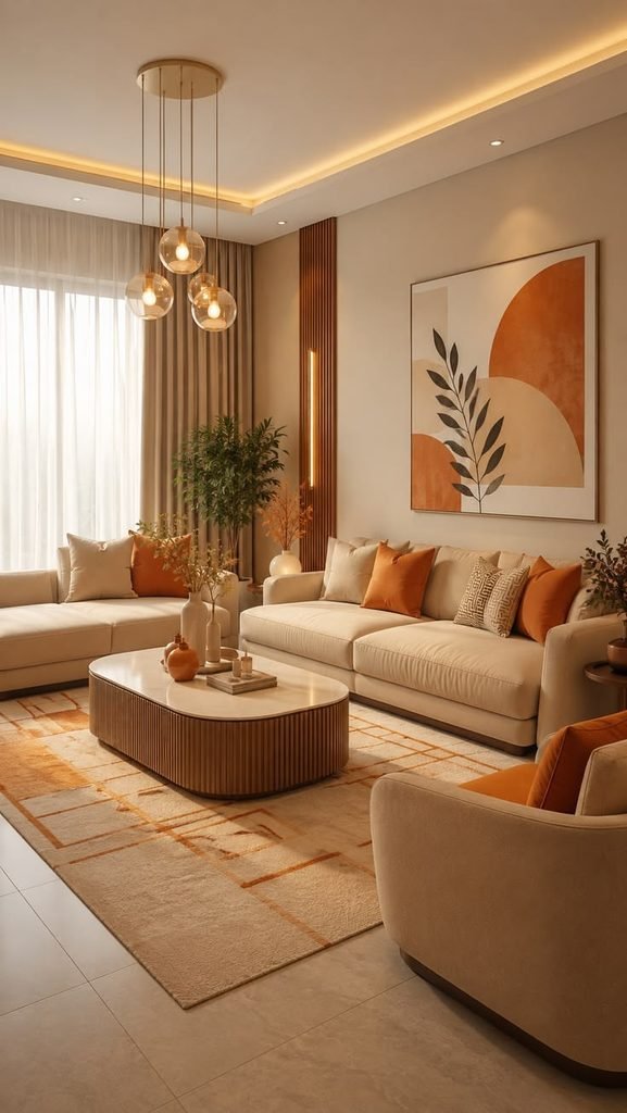
Not every fall color needs to be dark or saturated. Warm cream is one of the most useful shades for building an autumn-inspired palette because it gives stronger colors somewhere to breathe.
Use it for walls, bedding, curtains, upholstery, rugs, or larger furniture pieces. It can soften deeper shades such as burgundy, brown, and plum while keeping the room bright enough to feel comfortable.
Warm cream is especially useful if you want fall decorating to feel subtle. Instead of filling a room with seasonal accents, let the base palette do much of the work.
Pair it with natural wood, woven textures, and one or two deeper colors for a relaxed and timeless look.
9. Smoky Charcoal
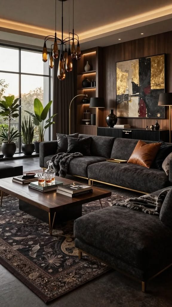
Smoky charcoal offers a modern alternative to black. It brings depth into a room while remaining softer and more versatile.
Use charcoal through upholstery, artwork, rugs, curtains, or smaller furniture pieces. It works particularly well in rooms that already have warm wood or cream-colored walls.
For an autumn-inspired combination, try charcoal with olive green and warm cream. Chocolate brown can make the palette even warmer, while muted mustard adds a subtle touch of brightness.
Charcoal is especially useful if traditional autumn palettes feel too warm or rustic for your taste.
More ways to decorate your home for fall
15 Beautiful Fall Decorating Ideas for a Cozy Home
How to Combine Fall Colors Without Overwhelming a Room
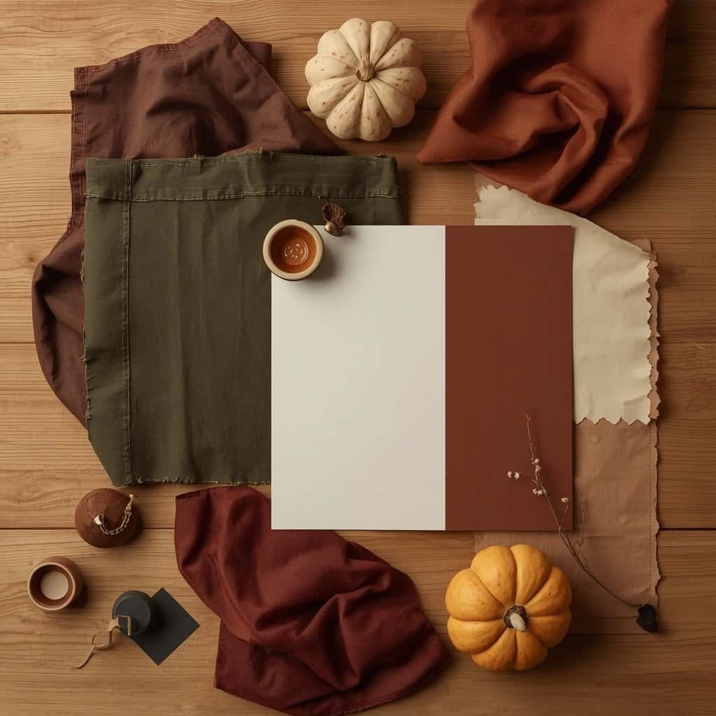
The easiest way to work with multiple fall colors is to give each one a clear role.
Start with a dominant color that already works with your room. This could be warm cream, chocolate brown, olive, or another neutral already present in your furniture.
Then introduce a supporting color through textiles, furniture, or larger decorative elements. Finally, choose one stronger accent for smaller details.
For example:
Chocolate Brown + Warm Cream + Olive
A grounded and natural combination that works beautifully in living spaces.
Terracotta + Dusty Blue + Warm Cream
A warmer palette balanced by a muted cool tone.
Burgundy + Chocolate Brown + Cream
Rich and intimate, particularly suited to bedrooms and dining rooms.
Olive + Muted Mustard + Natural Wood
Earthy, relaxed, and slightly more colorful without becoming overwhelming.
You can also let texture do some of the work. Linen, wool, wood, stone, ceramic, and woven materials can make a simple color palette feel much richer without adding more colors.
Choosing Fall Colors for Different Rooms
Different rooms can benefit from different levels of color.
Living Room
The living room is ideal for grounded colors such as chocolate brown, olive, warm cream, and terracotta. Use larger furniture for the dominant tones and smaller accessories for seasonal accents.
Bedroom
Bedrooms can handle richer shades because deeper colors often create a more intimate atmosphere. Burgundy, plum, chocolate brown, and warm cream work particularly well together.
Dining Room
Try olive, terracotta, mustard, or burgundy in a dining room. These shades can make the space feel warm and welcoming without requiring permanent changes.
Entryway
The entryway is a good place for a stronger accent. Charcoal, mustard, olive, or brown can appear through a runner, artwork, mirror, bench, or decorative accessories.
Because the area is usually smaller, you can experiment with a deeper color without committing to an entire room.
How to Make Fall Colors Work Beyond Autumn
One of the biggest advantages of choosing the right fall colors is that they do not have to disappear when the season changes.
The trick is to avoid making the color itself look seasonal.
For example, an olive cushion does not necessarily say “fall.” Neither does a dusty blue chair, chocolate brown sofa, or warm cream rug. They become seasonal when combined with highly specific decorations and motifs.
Instead of replacing everything when autumn ends, change a few smaller elements.
Swap heavier textiles for lighter ones. Replace strongly autumnal artwork or accessories with something more appropriate for the next season. Keep the larger furniture and core colors in place.
This approach is not only more timeless; it can also make decorating feel more intentional and less wasteful.
Think of fall as inspiration rather than a strict decorating theme.
Fall Color Trends FAQ
What are the best fall colors for home decor?
Some of the most versatile fall colors include chocolate brown, olive green, warm cream, terracotta, burgundy, muted mustard, and dusty blue. The best choice depends on your existing furniture, natural light, and preferred interior style.
What colors are traditionally associated with fall?
Traditional fall colors include orange, rust, red, mustard yellow, brown, and deep green. These shades are inspired by changing foliage, pumpkins, autumn landscapes, and warm natural materials.
What are some unexpected fall colors for a home?
Dusty blue, smoky charcoal, plum, and aubergine can create an autumn-inspired atmosphere without relying on traditional orange and yellow.
How do you decorate with fall colors without making your home look too seasonal?
Focus on colors that can work throughout the year and introduce seasonal feeling through texture rather than themed decorations. Warm wood, linen, wool, ceramics, and layered textiles can create coziness without making the room look temporary.
What colors go well with brown for fall decor?
Brown pairs beautifully with warm cream, olive green, burgundy, muted mustard, dusty blue, and natural wood. For a softer look, combine brown with cream and muted green. For more contrast, try dusty blue or burgundy.
Find Your Fall Color Palette
The most beautiful fall interiors are not necessarily the ones with the most seasonal decorations. Often, they are the spaces where color, texture, furniture, and natural materials work together quietly.
Start with one color you genuinely love. Maybe it is a deep chocolate brown, a muted olive, or even an unexpected dusty blue. Then build a small palette around it instead of trying to use every autumn shade at once.
If you want more ways to bring the season into your home, explore our fall decorating ideas for practical styling inspiration that works across different rooms.
Fall does not need to look predictable. With the right colors, it can feel warm, sophisticated, personal, and completely at home.